Images
The <ShowcaseImage> component can be used to showcase image entries which link to their respective pages.
Import
Section titled “Import”import { ShowcaseImage } from 'starlight-showcases'Specify a list of image entries to display using the entries prop.
Each entry should at least specify the image to display, a title and link to the respective page while an optional description can be provided.
Images use Astro’s built-in optimized asset support and should be provided as dynamic imports with relative paths to the image file stored in your project src/ directory, e.g. src/assets/showcase/image.png.
import { ShowcaseImage } from 'starlight-showcases'
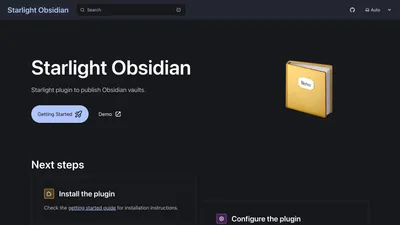
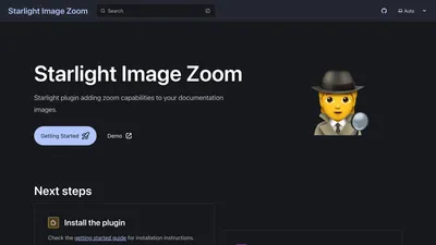
<ShowcaseImage entries={[ { thumbnail: import('../../../assets/demo/starlight-openapi.png'), href: 'https://github.com/HiDeoo/starlight-openapi', title: 'starlight-openapi', }, { thumbnail: import('../../../assets/demo/starlight-obsidian.png'), href: 'https://github.com/HiDeoo/starlight-obsidian', title: 'starlight-obsidian', }, { thumbnail: import('../../../assets/demo/starlight-image-zoom.png'), href: 'https://github.com/HiDeoo/starlight-image-zoom', title: 'starlight-image-zoom', }, ]}/>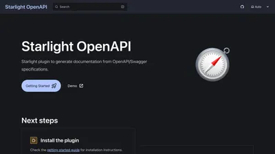
The <ShowcaseImage> component accepts the following props:
entries
Section titled “entries”required
type: ShowcaseImageCardProps[]
The list of image entries to display. See the Usage section for an example and the entry definition for more details.
Each image entry should be an object with the following properties:
thumbnail
Section titled “thumbnail”required
type: Promise<ImageImport>
The image to display as a thumbnail.
The image should be provided as a dynamic import using the relative path to the image file stored in your project src/ directory, e.g. import('../../assets/showcase/image.png').
required
type: string
The link to the page the image entry refers to.
required
type: string
A title for the image entry.
description
Section titled “description”type: string
An optional description for the image entry.